University of Edinburgh Portal Redesign

Tools
Figma, User Research Methodology
Context & Location
HCI Final @ University of Edinburgh
Year
2024-2025
ROLES
UX Design and Research
LINKS

Context:
This final project allowed me to work more seriously with the knowledge of academic design principles and common practices in mind. Every decision needed justification. Not "this feels cleaner" but "this applies the Gestalt principle of proximity to reduce cognitive load." Not "users will probably figure it out" but "this violates the heuristic of recognition over recall." The assignment was to redesign part of the university's learning management system for a specific persona, then defend our choices using established HCI frameworks. We worked in a group of four. The final prototype built on wireframes from an earlier assignment, refined through two rounds of peer feedback.
The Persona and Problem:
The persona we designed for, Niki Ivanov, frequently misses lectures and tutorials due to managing their academic responsibilities alongside professional and personal commitments. Their job involves unpredictable shifts to afford rising living expenses. Due to their limited time, they are unable to review missed lectures before the next lecture occurs. This problem is exacerbated for courses in which lectures occur on consecutive days. As the persona is unable to catch-up on lectures, this creates a compounding effect as they struggle to ever catch-up, this makes it difficult for them to fully engage with new material. Furthermore, identifying which lectures to prioritise for review adds another layer of complexity to their busy routine. In this context, a problem we have identified is the ability for the persona to review missed lectures, including determining which lectures have been missed, and therefore require review. The persona needs access to tools and systems that enable them to keep up with lectures whilst balancing other responsibilities.
Design Goals:
The persona's main goal is to achieve good grades. To support this they want a way to easily review their performance at any time, as well as a similar overview of lectures and other course content so that they can keep up-to-date on all the necessary materials to do well in the course. We created our design with the intention to deliver students this accessible overview in a user-centric format, catering to the diversity of methods that different students use to approach their studies. This means the interface must allow users to keep track of which lectures they have attended or missed, and offer them ways to quickly catch up on missed content before the next session. It is important that students have options in how they can go about this and that they can tailor their catch-up process to the time they have to spare and their own preferred methods of learning. Furthermore, we designed for students to have a clear and ready understanding of their assessment schedule and performance, while also clarifying any possibility of confusion regarding how performance is measured and what constitutes a "good" grade.

What We Designed:
We focused on two screens: the Lectures page and the Marks page.
Lectures Page:
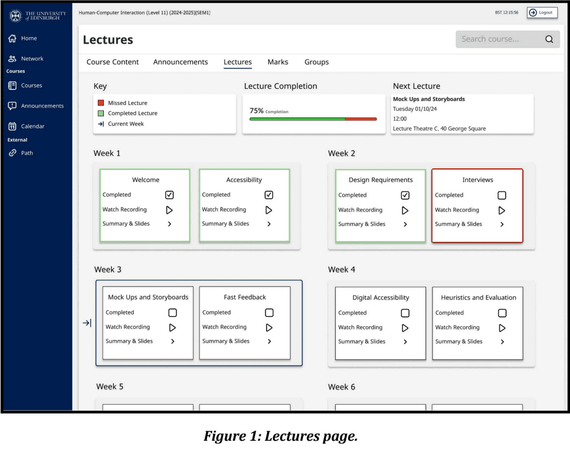
The original interface listed lectures in a single undifferentiated column. Our redesign introduced weekly groupings with visual separation between weeks. Each lecture shows a completion checkbox that users can toggle manually. This matters because Niki might watch a recording at 2am and the system wouldn't automatically know.
The lectures page (see Figure 1) is designed with a focus on simplicity, clarity, and helping the persona access relevant information. By reducing unnecessary distractions, the design ensures that the persona can focus on their primary task: locating the relevant lecture and engaging with its content. The structure and visual hierarchy was created for intuitive navigation and decision-making, allowing for the persona to make quick decisions in their busy schedule.
Each weekly box groups two lectures, with consistent formatting, drop shadows and titles to separate content to ensure the persona can navigate to their desired lecture. Clicking the "Completed" tick box allows the persona to update their progress interactively (see Figure 3). If a lecture is not marked as completed after it has passed, the border is changed to red to indicate it has been missed, helping the persona identify gaps in their learning and prioritise catch-up efforts. The lecture completion bar (see Figure 1) offers a fast method for the persona to understand their overall progress in lectures.
Once the lecture to be reviewed has been identified, clicking the "Summary and Slides" button for a specific lecture opens an overlay (see Figure 4). This overlay contains a brief summary of the lecture points, alongside lecture information and downloadable materials. This design reduces visual clutter by displaying only the selected lecture's details, rather than overwhelming the user with all lecture information at once. If the persona requires further information, they can easily navigate to the teaching materials page through a button in the overlay.
Gestalt Principles and Heuristics:
The Gestalt Principle of "Similarity" is demonstrated through the structured grouping and consistent design of the lectures page, enhancing clarity and usability for the persona. Weekly boxes, each containing two lectures, are uniformly styled with consistent shapes, sizes, and layouts, and are arranged in chronological order with clear labelling. This uniformity allows the persona to quickly grasp the organisation and sequence of lectures, reducing cognitive load and facilitating navigation (see Figure 1).
Colour coding plays a crucial role in supporting similarity, enabling the persona to easily track the status of their lectures. Missed lectures are outlined in red, completed lectures are outlined in green once marked, and upcoming or in-progress lectures remain in their default grey (see Figure 1 & Figure 5). This colour-based grouping provides immediate visual feedback, reducing the need for manual tracking and helps the persona in finding lectures that require review. Additionally, the ordering of colours, where red and green lectures naturally appear before the current week, help in the identification of missed completed lectures. or Consistency is also maintained through the iconography within lecture boxes, where icons for actions such as marking a lecture as complete are the same across all lectures. This uniformity ensures the persona can easily interpret and use interactive elements without confusion.
The lecture page is designed with the heuristic of "User Control and Freedom", ensuring that the persona has the flexibility to manage their progress according to their schedule. The persona can mark any lecture as completed, whether it is in the past, present, or future. This adaptability allows the persona to track their learning without unnecessary restrictions. Mistakenly marked lectures can be easily corrected by unticking the checkbox, ensuring interactions are reversible and fostering confidence in using the system without fear of errors. The lecture summary and slides overlay further supports freedom by offering quick access to detailed information, such as key points and materials, while avoiding restrictions. The overlay is designed to be easily dismissed by clicking outside it or using the escape arrow icon, ensuring seamless and non-intrusive navigation.
Marks Page
The original gradebook was confusing, especially for international students unfamiliar with UK grading conventions. What does a 70% mean? Is that good or bad?
Thus, the Marks page (see Figure 6) is designed to give the persona an overview of how they are doing at any one time. To ensure clarity and usability, the page is divided into three subsections: Grade, Grade Boundaries and Marks. The decision to name this page "Marks" rather than "Gradebook" avoids potential confusion, as "Gradebook" is not a commonly used term in English, and may confuse the international persona. The persona's progress is displayed through a progress bar at the top of the page, which alternates between showing the average grade in green and the grade achieved so far in blue (see Figure 7). The descriptive labels of "Average" and "Achieved so far" ensure the persona understands what is being displayed, and avoids potential anxiety or confusion about their grade. This subsection is placed at the top of the page to provide the persona with an immediate sense of how they are doing academically at any time, addressing their need for an overview of their progress.
Located to the right of the grade subsection, the subsection of grade boundaries clarifies the UK university grading system. By providing clear grade boundaries, the persona can better contextualise their achievements and gain a sense of how they are performing. For example, understanding that a 70% is considered a high grade will avoid any misunderstandings about how they are doing.
We use a table to show the marks of assessments to present assessment details in a structured, grid-like table, which includes critical information such as the due date, status and the mark. The table contains all assessments for the course in one location. Each assessment has 3 different statuses: released, submitted, and marked (and their counterparts). For the assessments that are not yet released, we blur their rows in the table so that users can focus on the assessments that have been released. The use of a formative label highlights assessments that do not contribute to their overall grade, helping them place priority on graded tasks and understand how their overall grade is being calculated. The structured layout of the table helps the persona scan and prioritise assessments efficiently.
If the personas want to know more about a specific assessment, they can click its name in the table and open an overlay (see Figure 8). This overlay includes information such as due date, description and submission status. The use of an overlay ensures that all relevant information is consolidated in one location, reducing the need to navigate across multiple pages. This design also avoids cluttering the page with excessive information at any one time, as the user is given control as to which assessment they require more information on.
Gestalt Principles and Heuristics:
The Gestalt Principle of "Proximity" is demonstrated by the layout of the marks page. The content is spatially separated into 3 distinct entities (see Figure 9) using clear padding and margins. Employing this principle helps users quickly recognise which elements of the interface contain information relevant to their current goals, while safely ignoring entities that won't be of use to them at that time.
Similarly, the Marks table exhibits the Gestalt principle of "Closure". While rows in the table aren't explicitly framed, the use of contrasting colours, aligned elements, and substantial spacing invites the user's perception to create distinctions between neighbouring rows. Users will naturally perceive each row as its own unified entity because of the continuous colour, and easily understand which informative elements are related.
The page additionally follows Nielson's heuristic "Visibility of the System Status" by collocating appropriate feedback with the Grade toggle. In the Grade section, the colour of progress bar changes with which type of grade it shows, and we also use descriptive labels "Average" and "Achieved so far" to explicitly inform the user of how the display should be interpreted.


My Role
All four of us contributed to the Figma mockup. We divided screens and components, then reviewed each other's work for consistency.
My specific focus was on two things. First, I developed and refined the persona. Niki's profile became our reference point for every decision. When we disagreed about a design choice, we'd ask "What would help Niki?" rather than debating abstract preferences. Second, I led the effort to connect our designs to course concepts in the final report. This meant going back through every major decision and articulating which principles it applied and why.
What I Learned
Designing for a fictional person felt strange at first. Niki doesn't exist. But treating them as real made every decision more grounded. Abstract debates about "good design" became concrete questions about whether a specific feature would help a specific person with a specific problem. I also learned that justification changes how you design. When you know you'll have to explain why something is the way it is, you make different choices. You can't just say "it looks better." You have to identify which principle you're applying and whether it actually applies.
The iteration process was humbling. Our first version had real problems. Accepting that, rather than defending our initial choices, led to a better final product. That feedback loop is something I want to keep practicing in the rest of my design courses and work.


